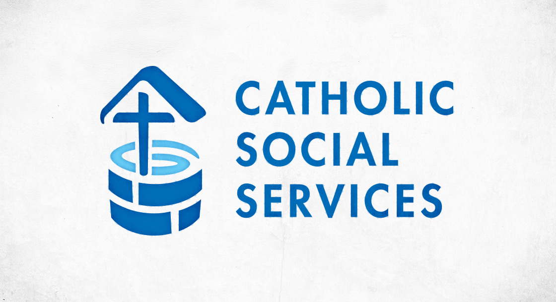
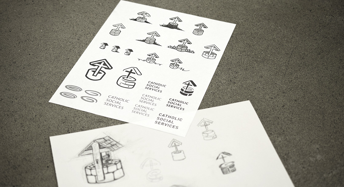
Catholic Social Services (CSS) is the largest multi function social services agency in Canada. They have been providing support for under privileged individuals and families for many decades and their logo was starting to show its age. Over time, it had also lost its sense of meaning. CSS commissioned us to come up with a new idea for a logo that would accurately portray who they are and what they do while maintaining a strong sense of their Catholic identity. For the latter consideration, the desire to include a cross somehow was strongly encouraged. A crucial characteristic of a successful logo is distinctiveness. The symbol of the cross has been used by religious and secular organizations for thousands of years which makes that prospect particularly difficult.
Some of the principal attributes that we wanted to depict were CSS’s commitment to providing for the material and spiritual needs of their dependents, being inclusive of people of all faith backgrounds, and encouraging a sense of community. As we defined these qualities, the story of the woman at the well who encounters Jesus came to mind. The woman was a Samaritan which was a different religious/ethnic group from Jesus’ who was a Jew. In that time, such groups were clearly segregated and rarely interacted in casual terms. They found themselves in the same place because they were drawn to it by a need for water (the well). While there, Jesus had a conversation with the women which led her to believe that he was a prophet. With that story in mind, the well becomes a symbol for overcoming cultural barriers as well as a place to have your material (water) and spiritual (encountering Jesus) needs met.
The next challenge was to include a cross in the logo. We decided to incorporate it into the structure of the canopy which protects the well from contamination. This is a profound allegory for the cross of Jesus as it protects humankind from a hopeless fate as God steps into death in order to overcome it and lead us beyond it.


